10 September 2018

Changing Color and Dancing Shapes - Richardsonian Romanesque

Richardsonian Romanesque style does not bring to mind much in the way of changing color or dancing shapes.  I think of the style as somewhat colorless, squat, bulky and awkward. Yet, the style did come about in the American Victorian Era, so there is hope.

Fingers crossed for hope as we dive into the restoration and rehabbing of a 1909 mixture of Richardsonian, Romanesque, Stick Style and more.  

This house, like many of its time, is not the light filled open concept currently preferred today.  It has original stained, never painted, Magnolia Wood trim and lots of it.  It has plenty of clear as well as stained glass windows but there are dark areas.  The most expansive space is in the front stairwell and adjacent halls.


As with any design project and certainly one of this scale, we need a design focus and guide that helps lead the way.  We don't want too many more design elements and styles than those of the era that had already been thrown in from the get go.
Project Mission:  Restore, rehab and update while protecting and respecting existing architecture and styles. Lighten up the interiors without painting wood work and trim.  Utilize formal dining room in less formal ways while preserving its more formal function. Replace inefficient mechanicals and failing exterior components.  Repair non-mechanicals when possible. Update and make kitchen, sunroom, and butler's pantry feel more open and connected.  Create a gentleman's library.  Update one bath and add a shower.  Renovate a bath. Add a third 2nd fl bath and closet space, creating a master suite. Finish out the third floor room and add a bath.  Keep all existing original walls to maintain stability of complicated structural components and roof structure. Plan for interior elevator if at all possible. 

Design Concept:  The exterior will be cohesive and inviting with obvious front and side entries. It will look like a well maintained and livable historic house.  A family of five or more could live here comfortably and function at today's high end standards.  There will be a sense of Zen with an eclectic mix and, there will be color.


The Mission tells us what we need to do, the scope of the project.  The small paragraph of a Design Concept is the major guiding force that will help us change colors with the desired effect and make shapes dance in the way we intend.


First up in the design process is to measure measure measure and become familiar with every nook and cranny, inside and out.

The overgrown exterior was cleared so we could see the place on all sides!  We discovered wonderful Richardsonian Romanesque arched window vents.


We took our time in getting to know the place and learned of its previous inhabitants.  We started researching and sourcing and finding skilled craftsman and tradesmen.  We went through many name possibilities and decided on a name more fitting to the Design Concept than the current name of the original male owner.

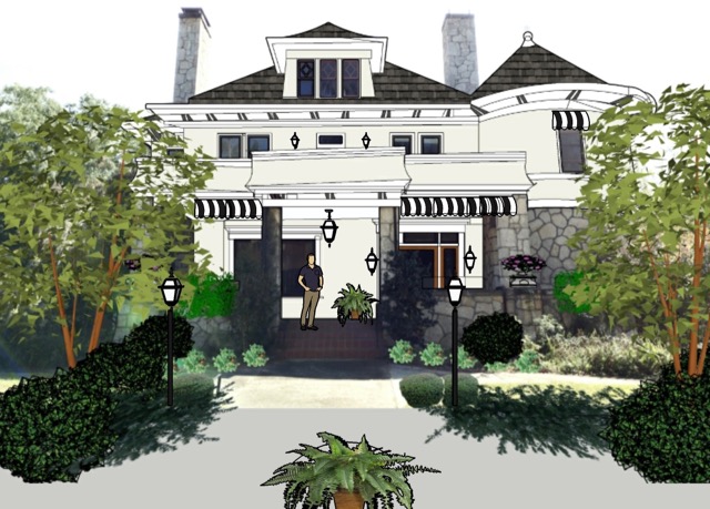
We made some sketches and played up the dominate Richardson Romanesque style and toned down the Victorian Painted Lady on the exterior. Changing color on the outside helped us add that sense of Zen to the first impression.  Color strategically placed let us change the perceived shapes.


We named her.

AvaMagnolia

09 September 2018

Off The Wall And Special Things - Ancient Feet

On a recent trip to Italy, I found myself  inspired by ancient, or at least very old, feet.  To my surprise, a multitude of feet were smack on at eye level.  You see, it didn't take many churches, basilicas, or museums before my titanium plated cervical spine rebelled at ceiling gazing.  I discovered feet!


The challenge was to turn these feet into design inspiration.  Oh, well, yes, turning them into a business trip made cents as well.  Err, I mean 'sense'.  After all, photos and design inspiration do more for my business than any other kind of advertising.

But, what can a designer do with feet?  My tourist trekking feet hurt just thinking about it. However, it wasn't long before my aching neck calmed down and I realized they were not just feet.  They were just as much a design element as any shoe in today's fashion world or any light fixture in an interior.

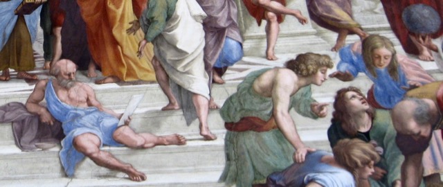
Take a look back at the picture above (a close up of wall painting in the Vatican.) It is the feet and their many positions that give this painting as much movement, if not more than, as the other elements you can see.  Feet are important.

Before you noticed the nails holes in the feet to the left, you may have noticed the gripping pained toes. Feet can tell a story.  Design elements in any media can tell a story.


This foot not only sports a shoe that would be at home in any city in today's world, it moves our eyes to the right.  Not only does it move us and our eyes to the right, it does so with a sense of strength that is purposeful.  The foot works in harmony with the draping of the garment to enhance this sense of powerful movement.  Feet and design elements are not just out there all by themselves.  They have purpose.


The feet below on the lion body are softly powerful with their scale to the rest of the body. Their shape shows how they can push off the ground.  They are feet that we can recognize and connect with strength and quiet power.  Design elements can connect as well, to things we recognize and appreciate, such as a certain style or a skilled craftsman and wealth.


The bird feet are what help us to know they are attached to a bird.  It is their shape and ability to grip around the element beneath them that helps us to recognize what they are.  Sometimes designs leave us clueless, but most of the time we know through a design's elements if it is utilitarian, such as the softness and shape of a chair seat.  This type of element in design can also bring a sense of realism into something that isn't.  

The lion's feet are more flat to the line below it and the effect is that the body and all around them look flat, not real.  Ah, the bird's feet, by the minimal amount of curl around the element below them, they give the whole scene more depth and realism.


The feet on a close up of a small relief panel at right are certainly discernible, albeit not well detailed.  Still, they play an important role in the story.

The dark shadowed areas of the robe add depth to the scene.  The feet, they add perspective.  One foot comes from under the robe, making the robe seem further back and the foot closer to you.  The other foot sits outside and down from the robe, giving even more of a perspective or distant aspect to the elements above it.  These are design elements.  This type of perspective or sense of depth can be achieved in interiors as well.

The feet on the left show, power, wealth and stability.  Look at how stable the shapes are. Even though one foot is lifted, it is not at all an awkward or feeble movement.  The feet work in harmony with the other elements of the scene.  The strong and substantial looking shoes add to the strong powerful story.  The Robe has movement but does not look flimsy.  The toes are relaxed, not gripped as in Jesus' feet seen above with nail holes.  The design element of color works here as well to tell us about wealth and boldness.  The robes are the gold of money and the shoes the red of the famous rare stone of the day.  It takes a bold and wealthy person to put these seemingly well manicured feet into these shoes and robes.

It is all about harmony.  These Roman feet work hard to contribute to their setting as a whole.

There are many ways for design elements to tell a story.  The feet, and hands, of this statue also show strength and power.  This power is more physical, more raw.  There is no color to clue us in, but we have scale and shape and lines.

There is a softness to the lines of the robe, however, the robe falls around a mighty large scale knee and foot.  The lines of the hands and foot are hard and even somewhat rough looking.  There is no manicured foot as above.  The toes are spread, suggesting strength and solid grounding.

This foot works in harmony with the rest of the statue to tell us a story.  It adds more than you might think to the story.  Put your hand over the foot so you can't see it and notice how the power and strength of this statue diminished.


The feet of this statue also look powerful.  Yet, they are not working in harmony with the rest of the scene to promote power and wealth.  Their role here is to relax.

The toe positions of the lower foot and the loose downward drop of the foot itself provide a sense of relaxation.  It doesn't really look comfortable, but relaxed in its setting.  The downward movement of the shape of the leg and foot tells us there is no need for gripping toes here. The lines are mostly vertical and point down, these lines are relaxing design elements in any media.

The Horizontal lines of the foot, hand and arm above are the opposite design element.  Horizontal lines can be a bit more unsettling and can provide a tense awareness.  Bringing harmony to a whole scene or space in any media takes knowledge and skill.

The swaying tilting movement of the lines of the feet, legs and bodies in the first painting above give movement and action.  It is the same in interior design.  The more relaxed curves of the feet, legs and bodies above are a design element that adds a soft and easy sway.  It is not chaotic or too dramatic.


Although you cannot see more than the foot and a bit of leg here, you know there is tenseness and unrelaxed elements to the scene.  The foot is hanging down without support and not showing power in that way.  Yet, the scale of the foot from this angle does show some power and strength. The foot looks as if it is at a strong angle to the leg, another unsettling not soft design element. It looks wide, there are horizontal lines that don't quite let us feel relaxed.  There are horizontal lines in the stone behind the foot that add to this scene of heightened awareness.  Circles are a strong dominating design element.  The bottoms of most toes here are pretty much circles.  This adds even more strength and power to the scene. Place your finger over all but the big toe and notice the softer version of the scene.  Circles are strong.


This foot is substantial in scale to the robes above it.  It is flat and stable, yet the strong angle between foot and leg, as well as the horizontal line of the foot, tell us not to get too relaxed.  There is some power and strength here but at the same time the soft curve of the robe and its vertical lines help us to feel comfortable with this scene.


This copper foot is dangling from a horse, there is no stirrup.  The foot is all tied up, protected.  It is not quite relaxed as we can surmise from the horizontal line of the bottom of the foot.  The color of it's aging mottled copper is a bit forlorn. Although there is as much substantial shoe as in the red ones above, this shoe is not provoking power and strength.  The material of the shoe does not seem thick.  The shoe laces sag down with slight curvatures.  It is relaxed.  The design elements of the foot and its wrappings are not strong due to the lack of strong detail and depth.  This is the foot of Mark Antony.


It takes great skill to use all design elements in harmonious ways to produce a desired effect of the whole.

Rome, has been known for centuries to be a great place to study design and perfect one's knowledge of its elements.

Who knew that not looking up, while in Rome, could make one focus on design elements often missed when trying to take in such enormous scenes?

I am now much inspired to use design elements in the smaller details of my work.



RePurpose ReUse and Green Stuff - Iron Fencing

We've all admired gorgeous old iron fencing here and there.  And these days old iron fence panels or pieces can easily be found in salvage and antique shops.

I've seen all kinds of things made from them, but what I needed was exterior porch and stair railing with an affordable wow factor.

I can't say it was easy finding the right stuff.  I found antique iron designs that would work well, but there never seemed to be enough for my project.  Finding a fabricator able and willing to take on such a task wasn't easy either.

I met with many fence and railing companies but their ideas and mine didn't exactly match up.


Finally, a local salvage shop, Black Dog Salvage in Roanoke VA, had what I was looking for! They also gave me a name and fabricator that they thought could handle the job, Glenn Raulfs, Glenn's Custom Metals.

I did not hesitate in purchasing the old iron.  I had lost out on great pieces at this salvage store before, not this time!

Glenn picked up the old fencing and took it straight to his shop.


The next step was the design process.  We worked together holding up pieces of the heavy stuff and sorted out how to best put it all together -where to cut, how high, code issues...


Then came the measuring and measuring and measuring.  Double curved steps, custom made and not exactly the same, was a bit of a challenge.


Curving new iron top and bottom railings and top cap and getting the slope had to be done in the shop.  To do that, Glenn built two curved wood stair sections, to scale, in his shop. However, he did not fabricate the total iron stair system in the shop, that would have been too heavy and cumbersome to move.


Once he had the new curved upper and lower iron rails and cap he did more measuring and added vertical support balusters.  The antique ornamental balusters were all individually cut from the old fence panels.  They were cut at an angle on the top to go under the sloping curving top rails.  Each antique baluster of the stair railings is attached to a new vertical support that had been welded in place.

The iron posts on the porch and landing were next. The railings were attached to the vertical posts.  Railing was not attached to the brick house siding, but to another vertical post.  Bottom vertical supports, under the bottom rail were added for further stability at the longer section on the landing.

Once the posts had been set and screwed and mortar cured, the cut to size antique iron fence panels were placed inside the new top and bottom rails and soldered in place.  Sounds easy.  It was a lot of work and careful skilled craftsmanship.

  After this, the stair railings with all parts and pieces could be installed.  But not before more measuring and placement of the four posts, two each at the bottom of the two stairs.  Measuring curves and slopes for fabrication takes a serious craftsman.  Then there is the placement of the posts. The new curved top and bottom railing systems had to connect at two ends with little room for error.  At the upper and lower rails on one side of each stair, more iron pieces had to be installed for the transition from porch to landing to stair steps.


After the bottom stair posts were set, screwed and mortar cured and all transition pieces were fabricated and welded in place,  the new curved top and bottom stair railing systems were installed and welded in place.


A side note is that the existing light fixtures had to be raised due to the height of the porch  top rail and cap.  These lights were important in choosing the fencing for the railing system as the iron detail needed to compliment each other.  The stairs look amazing, if I may say so!  They are structurally sound and secure.


The very best part is that the railing system looks like it has always been there.


17 October 2015

Off The Wall and Special Things: Holiday Tables

When thinking of Holiday table settings and center pieces, it is always a good idea to go with a basic set up.  Think of it like a wardrobe.

Choose basics that will take you from Fall through New Years.  Then, add and remove accessories to fit the Holiday and the meal.  It is not that difficult to turn the unused formal dining room into a dinner party waiting to happen.

"When the table is beautiful and the lights are low with flickering candles, there is always magic.  If you add family and friends and share stories and good conversation -  the food won't matter." You don't even have to cook, just bring it home, lay it out, and enjoy your guests.

I love the natural material animals that have been trendy the last few years.  Recently I purchased two nice sized deer, a raccoon, fox, two owls, three smaller fox tree ornaments, two squirrel ornaments, and, a porcupine tree ornament.  This year they are my Holiday table settings inspiration.  No doubt, I will use them somewhere for many years to come.  The challenge was to use them this year as basic dining decoration, allowing enough accessory changes to make the table different for each Holiday.

The animals set the style.  I started with a Fall/Halloween setting, placing the animals where they would stay for the duration.  The larger fox found a spot on a silver server.


The porcupine made an unexpected statement along side a silver tea service.  The larger owl perched on a wine cooler.  The two squirrels made their way onto the chandelier.  The three smaller foxes, the smaller owl, and the two deer added whimsy to the table.  The raccoon, sporting a red vest, would wait until Christmas for his debut.  


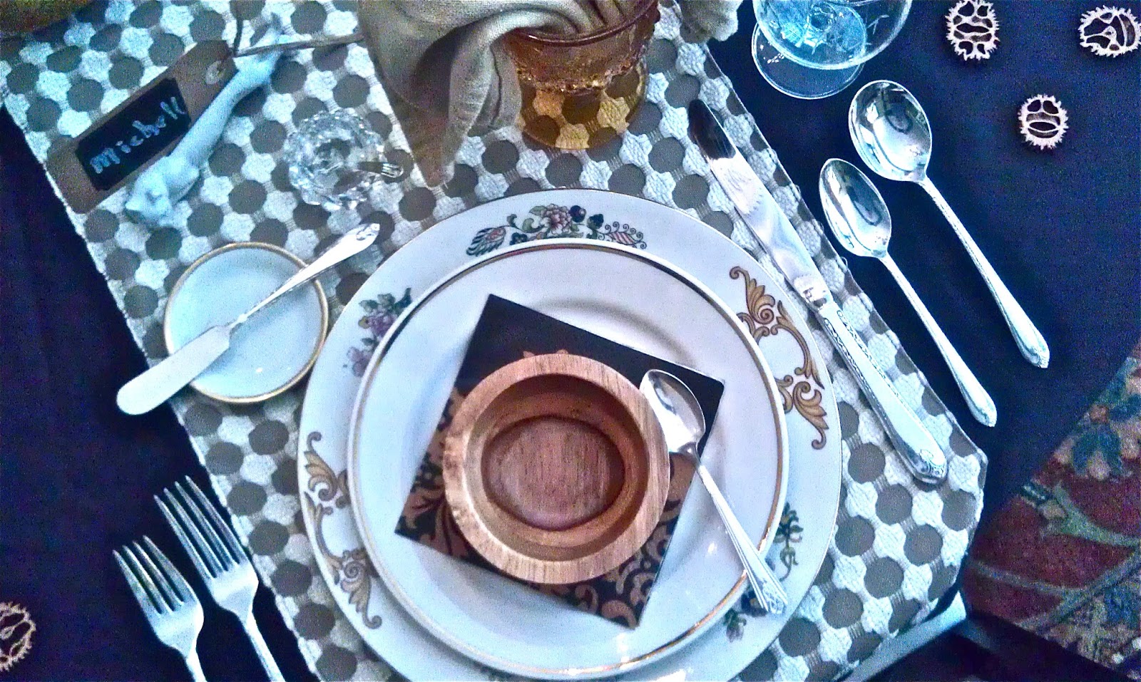
Next I chose some plates, silverware, glassware, napkins and so forth that would work with four Holiday table settings: Fall/Halloween, Thanksgiving, Christmas, and New Years.  Table items, shown below, that serve all four Holidays are: basic black table cloth; three table runners that cross and work as placemats on the round table; natural color linen napkins; knife, dinner fork, salad fork, spoon, soup spoon, and butter spreader; individual salters and peppers; and, place plate/dinner plate.

Table items, shown above, that serve two or three Holidays are:  amber forest etch goblets, small wood bowls, gold rimmed salad plates, brandy glasses, and butter pats.


Seasonal paper napkins are used as an accessory under the first course items for an easy change to fit the Holiday.  Black paper napkins are used under the wood bowls.  The same dinner napkins are used in various ways to help make the table look different for each Holiday.

White porcelain cats hold chalk board name tags, varnished sliced walnuts are scattered about, and the linen napkins are loosely displayed in the amber goblets.  This Fall/Halloween setting brings a low key ambiance to a formal dining room.


The Thanksgiving table gets a pine cone center piece and clear glass name tag holders.


The amber goblet etched with a forest scene will be used for a seafood appetizer and seafood forks are added to the table.  Crystal bread plates are used however, mismatched water and wine goblets along with the wood bowls, now used for nuts, maintain the low key ambiance.  Fall deer scene paper napkins are placed under an appetizer under plate and the linen napkins take a more formal position.


For the Christmas table, the salad plate changes and the place settings look a bit more formal with matching crystal goblets and small champagne glasses.  Yet, with the raccoon perched on the pine cone center piece, tall pine cone candle holders, and individual gift bags  - the ambiance remains somewhat low key for a formal dining space.


The whimsical animals and natural materials on the table along with the no fuss gift bags keep the formality of the dinner at a minimum.  How could one be uptight with such adorable little foxes?


Delicate Christmas paper napkins add to the Christmas spirit under green crystal appetizer compotes.  The wood bowls hold Christmas candy and colored bows appear here and there.


A large top hat is used as the main center piece for the New Year.


And, some of the animals get their own hat.  New Year excitement is added with sparkle and shine.  The raccoon moves to the server sporting a bow tie, an appropriate addition for a more formal look with the red vest.


New Year table accessory changes are: gold tassel napkin rings; gold under plate with crystal shot glass for a NewYear toast; gold trimmed paper napkin; a small "Cheers!" notation: place name tags; matching etched crystal goblets; gold and silver balls as part of center piece; votive candles in brandy glasses; crown votive candles; and, other candles on crystal plates.  The wood bowls are not used.  Crocheted coasters tone it all down just a tad.

Get your dining wardrobe on!  Find something that inspires you!


Create your own Holiday magic and move from fall through New Years with great dining ambiance.