05 April 2014

Color and Other Designer Horror Stories: Lighting Changes Paint Color


As if there isn't enough for us to consider when renovating or decorating or just painting a space  - now more than ever we need to be aware of what our lighting choices do to color!

New and more efficient lighting is available and our old incandescent bulbs/lamps are quickly disappearing.  I for one would appreciate light boxes in paint stores where we could quickly see how the various bulbs/lamps change our favorite paint colors.

In the photo, right, my gorgeous blue paint is even more blue and gorgeous with the halogen spot lights on it.  Ah, but the very same paint out of the very same paint can is quite green above the kitchen area cabinets lit by fluorescent tube lighting.


Wow.  That green was not what I had in mind next to the warmth of the Maple cabinetry and Brazilian Cherry floors.  I needed a blue to cool the place down a bit.

A mixture of lighting even changed the paint color from the gorgeous blue of the halogen spot lights to more of a green blue with the same lights mixed with natural light from the windows.  Notice the color around the white door frame in the picture below.

Regular incandescent lighting from the sconce and desk light made the paint a little greener than the rest of the large wall shown below.

Goodness Gracious!  I see at least six different paint colors from one can of paint and four lighting sources.   What can be done?

First of all, we could limit the number of lighting sources.  In this  example space, I would use halogen bulbs/lamps in the sconce and desk light and other ceiling sources.  I would remove the light above the kitchen area cabinets or change it to halogen.

These photos were taken in the early 90's.  Today we have even more lighting options.   Knowing how we see color and which color pigments are in the paint bucket would certainly help paint color decisions.  At the very least, we should do what has been recommended for years and that is to buy sample paint and put it in various places of the space to be painted.  Even natural day time lighting versus evening lighting can have dramatic and different color results.


In a recent kitchen renovation, I loved a golden yellow historic paint color next to dark walnut stained cabinets.  That is until the energy efficient fluorescent light fixtures were installed.

There were only two types of light in the kitchen, the natural day lighting and the energy efficient fixtures.  Still, the fixtures changed the paint color so much during the daytime even, with lots of natural light coming in from the windows, that I was shocked.  Closer to the fixtures it looked like we carelessly painted an entirely different color  - an unnatural green!

Beware my friends and check that paint with the light fixtures and bulbs/lamps you will use!


22 January 2014

Specific Requirements: A Bit Of Glam!

When a client tells me they want "a little glamour" I see high gloss shine and unexpected luxury.

There are many ways to do this and shiny surfaces are a great place to start.

When the dining room of this house was updated, the original Federal style dining room chandelier was moved to the center of the Den.

Hanging there alone in the middle of this large space, where a ceiling fan once hung, it seemed small and outdated.  A retro-fit fabric drum shade gave it new life and more presence.


The chandelier hung over a coffee table and worked with the L-shaped sectional to center the space.  It even had a little high gloss shine.  Although the shade was unexpectedly nice and worked well with this chandelier, the fixture needed "a bit of glam."


Prisms!  I found some triangle shaped long ones in a quaint little antique shop in St. Petersburg, FL.  It was important not to use too many or make the fixture so showy that it would grab your attention as soon as you entered the room.  I did not want it to look like a formal dining room chandelier.

It took some thinking to work out a way to attach the prisms to the arms of the fixture.  I finally stumbled upon some thin and strong clear fishing line.  By tying it around each arm at the lowest point and leaving just enough room to slide the prism hook through, the attachment was not even noticeable.


Even with prisms, the chandelier does not compete with other elements of the design, it harmonizes.  The space is inviting and comfortable -as a family room should be.  Yet the room seems special, even a little luxurious.

And, oh yes, as you enter and move about you will surely notice there is "a bit of glam."

27 August 2013

Design Finds, One of a Kind Trash or Treasure: Put A Shade On It!


I'm not the only one who likes to use vintage lamps.  If you have not done so  and would like to give it a try you'll need to know the down side.  Finding lamp shades for odd lamps or permanent harps can be a daunting task.  Although, one can always go the expensive custom route and get the job done.

My attic once held quite a collection of old lamp shades and lamp shade wire skeletons.  However, they never seemed to fit my lamp finds or the style I was after.  I do like the way the wire skeletons are being used these days and have saved a few should there be an appropriate occasion or client.


If you are truly interested in going the vintage route you probably shouldn't pass up an opportunity to purchase nice quality new lamp shades when the price is right.  This habit along with a vintage or even new lamp find can mean the beginnings of a "One of a Kind Trash or Treasure."

And, you might want  to collect some finials as well.  Finials are often missing from vintage lamps.  New ones, or great vintage finds, in a scale to fit the lamp, plus new shade, will change the look completely.


This vintage Stiffel lamp with its strange small harp and long stem, shown below, was very outdated with the original tall drum shade and tiny finial.


I tried several new, but not such good quality, shades from the local big box stores before stumbling across this great quality lamp shade design find, shown above right.   New finials help balance the old lamps with the smaller square shades.  The more current good quality fabric shade and style makes the old lamps seem new again.   Now the lamp pair is stately, chic, and of this century.

The lamp shade design find shown right is unusually tall, a trait of vintage permanent harps.  Wouldn't you know it, though, it found a place on a lamp without a tall permanent harp.


This shade can grace a smaller lamp than one would first think of and give amazing presence to various sizes and shapes.  I love the ambient light that shines through this interesting ribbon like shade.  Once again, the finial completes the new look.

Not all vintage lamps need to be rewired.  You will need to check them over carefully though and make sure the switches are not worn out.  Most big box stores carry rewiring supplies in an inexpensive kit and turn keys for old turn switches are readily available.


Vintage lamps without harps can be updated as well.  This one, shown right, needs a glass shade.  You can buy vintage or new glass shades, just be sure to buy the kind that will securely hold your new soft shade. The ones with ridges, shown below, allow the shade frame top to sit snuggly.  You can use a screw from under the shade to hold a finial.


The updated lamp, shown right, is probably not what you visualized when you first saw the lamp base.  Repeating a design element of the lamp in the finial often gives a good result.  This lamp has a round brass circle at the base, a green circle wreath above that, and another more detailed wreath further up.  A circle finial in a brass color works well.


Square, rectangular,  and unusually shaped shades are popular right now.  Current style shades make instant updates.

Go ahead, give it a try.  You will love turning trash into a one of a kind  treasure.


13 March 2013

Repurpose Reuse and Green Stuff: Whimsy that Functions

I go back and forth between peacefully enjoying the tranquility of minimalism and child-like frolicking with the discovery of interesting things.  I even admit to loving a bit of whimsy!  That said, I am a designer who fully appreciates function.

Whimsy that functions, how fun!

My prized whimsical piece is an iron "butler" who once held cigarettes, a lighter, and an ash tray.

This elegant gentleman has held canes or umbrellas close to my front door for years.  More recently he has been in my closet holding scarves.  But my current fascination with Downton Abbey has me thinking he should once again be more prominent in my life.


A little creativity can make whimsy function.


How can this butler become a
functioning part of our larger household?  After all, wars are long over and butlers long gone.


Since I am in the process of dreaming up a "butler's pantry" where my guests can help themselves to coffee, tea, drinks, and goodies I'll start here.


He can hold the spoons, cream and sugar above a tray with the cups, saucers and coffee pot.


We do a 'sometimes' annual Black Tie New Year's Party that would benefit from his services and get him out of the pantry to greet the guests.


He could help out in the kitchen.


He could wait patiently with a hand towel or hold a few kitchen items.


Or, he could really make himself useful and hold a lot of kitchen stuff.


He would be a whimsical surprise in the powder room.


Whimsy can be casual or have a more formal appeal.

Whimsical pieces can add interest and, of course, the unexpected.


Below are more functional whimsical items.  Perhaps they will inspire you to put some functional smiles in your home.


Kris Kricket will make anyone smile.  He has been with me since childhood.   And even though a little beat up and minus his front wheels, he kindly holds a stack of erasers.


I love this amber glass and brass deco cigarette holder.  It gives the business on these cards a sense of permanence and importance.


A vintage pressed glass compote casually offers napkins at the breakfast table.  The shape and and idea of using such a piece for a napkin holder shouts fun without being overly casual.


No need to drum your fingers while working at this desk.  The hand made wooden toy will do it for you.  The sticky note pad it keeps close by is hardly even noticed.


This unusual shaped Victorian basket keeps my business cards within easy reach.


An inexpensive chalk board was the perfect size for the side of a kitchen cabinet.  It can offer up the menu for dinner parties or keep a grocery list handy.  Hooks were added at the bottom for holding measuring cups, spoons and more.


This vintage stand with inlaid mother of pearl was so cute I had to have it.  It holds a plant here but could hold just about anything.  I have no idea of its original purpose.


Who could function without an old truck head light made into a trivet?


Or, a funky old vacuum to hold the umbrellas!


25 December 2012

Off The Wall And Special Things: Antique Dining Furniture Update


It isn't easy using large antique furnishings in today's dining rooms while staying current and stylish.  Refer to my blog post of September 2012, Specific Requirements: Antique Dining Furniture, as this post is an update of that earlier project.

An appraisal was done on the project furnishings, pointing to the appropriate decision of cleaning, touching up and repairing.  Complete refinishing would have lowered the value.

Using the design path created in the above blog post, I carefully chose lighting, fabrics, and accessories to work with my old behemoths, the original rug and colors of other areas on the main floor of the house.

The chair seats got a large current pattern fabric in a neutral tone, Riad Dune.  Lined curtains were placed in front of the bay window area on a dark wood rod.  The dark wood relates to the dark dining furnishings and the curtain fabric is of a large modern sized toile with a brown background in a Linen and Rayon blend.  Placing the curtains in front of the bay allows for optimum vertical height.


The formality of the silver chandelier was toned down by using dark natural linen shades.


Large retro style lamps fit the scale of the dining pieces and bridge the gap between today and the early 1900's of the furnishings.

Wooden bowls, boxes, baskets, and a mixture of vintage and modern table settings help to make the room less formal and more current with today's trends, without trying to make the furnishings be other than what they are.

The walls were covered with a textured green fabric, an updated colorful grass cloth look.  The green color works with the rug, furnishings and accessories of the adjacent room as well.


The dark background curtains help balance the back of the space, where there is a lot of light from the windows, with the front of the space where the large buffet is placed (it is on the left, not seen in the above photo).  The server that is seen on the right, in the back of the photo, also helps to balance the larger buffet, not shown.  The five foot diameter round table is in the middle of the space under the chandelier.  The table can seat eight without the addition of leaves.  Yet the room still feels spacious and inviting.

The server and buffet are placed on opposite corners in an attempt not to crowd the table and traffic flow around it, refer to the above mentioned blog post for the space requirements.  New mirrors above these two large pieces help lighten these areas and give a feeling of more space around them.  The larger mirror is used over the smaller server piece, giving it a larger sense of scale and helping balance the opposite larger buffet.


The bay window area is the perfect spot for the large lazy suzan style silver serving piece.  The buffet is too high for this piece.   Placed on the server furniture it sticks out into the room, crowding the table and chairs.  This permanent display solved a storage issue as the piece is 34 inches in diameter.

Although the original plans and design path called for the addition of a china cabinet, once the project was underway it was thought to be too much furniture.  Using the bay area for the lazy suzan server was adopted as a new option for the plan.


While the silver tea set kept its original spot on the buffet  -small hand painted antique tiles with neutral colors, dried hydrangeas in a silver bowl, a tiny carved wood trinket box, large retro style lamp with dark natural linen shade, and amber candle holders maintain an elegance without being overly formal.


Mirrors still need to be hung and art work chosen.  The art and wall hung pieces have to work hard in this space to maintain the balance of old and current.  It is worth waiting for the perfect pieces to come along or be commissioned.  The design path set forth in the earlier blog post stated that art of a personal nature be used.  Art placement may also make a difference on the exact placements of the mirrors, they will learn against the wall for now.

Although the art part of this project has not been completed, the room is certainly ready for use.  Further detail can be added to this space and any space at any time.  Some changes can be made without disrupting the style and sense of the way it is now.

Look for a future blog post on the three phases of a space and how some people like to live with phase I while others move on to phase II and still others like the highly detailed spaces full of character and objects found in phase III.

This photo is of the completed space with art and mirrors hung.  See more photos of the room
on the Houzz web site.

02 November 2012

Color and Other Designer Horror Stories: Fancy Table Settings

Most likely, we can all relate to a Holiday or fancy occasion meal where it wasn't the food that went wrong.   Colors that don't work well together, seasonal pieces that are past their prime, and odd pieces that just don't seem to fit today's world can take some of the special out of any occasion.

 An enjoyable table setting will be harmonious with all it's parts and pieces.

Here is what you can do to prevent your event from becoming another horror story.

For starters:  Know the basic china, silver, and glassware that you have on hand to work with.


Sure this sounds simple, but how many of you really know what you have stuffed into your cupboards over the years?  Or, what pieces broke way back when?

A good way to know what you have is to pull it out and photo it.  List how many of each.


Doing this, I discovered I have three china sets for special entertaining.  One set is a complete set for twelve, shown top left.  Another is complete for 5, but there are 12 small bowls, cups and saucers and 8 dinner plates (shown right).  The other is for 20, except for one plate.


I have eleven green with gold soups and 12 saucers.  I have 12 green with gold demitasse sets.  I have 8 gold demitasse sets.  I have salt dishes, butter pats, relish plates....

Who uses all this stuff?

What I needed to know, and what you need to know, to quickly deal with the basics of what's on hand and get on to making our tables fabulous are: What colors and what shapes work well together?  If doing a dinner for eight what are the options?  If service is required for six or for twelve?  What if it is a basic three course? Or, a fancy seven course?  What can demitasse sets be used for?  Is there another use for shot glasses?  What about those tiny "liquor" stemmed glasses?  Is there another use, other than that first intended, for the other oddities we can't seem to get rid of?  And, what can be added to make our table settings look more up to date?

Lets talk Shapes.

Most china is round, no problem.  However, there are squares, ovals, rectangles, octagons and even twelve sided, as shown in two of my sets above, and more.  Circles, or rounds, dominate a design.  Placing a round on top of another shape will work depending on their sizes, and vice versa.  A good rule of thumb is smaller rounds on top of larger other shapes and same size or smaller other shapes on top of rounds.   Experiment, if you have varying shaped pieces.

When it comes to glassware, shapes can work hard for harmony or subtly, yet mightily, work against it.  When placing different shaped glasses next to each other note the negative space between the "bowl" of the glasses.  Is the space between the glasses pleasing, like the two different glasses shown left?

Is the shape the same, such as these cobalt glasses?  Are the patterns alike, or close, such as in the cut and etched design above?


Shapes are important.


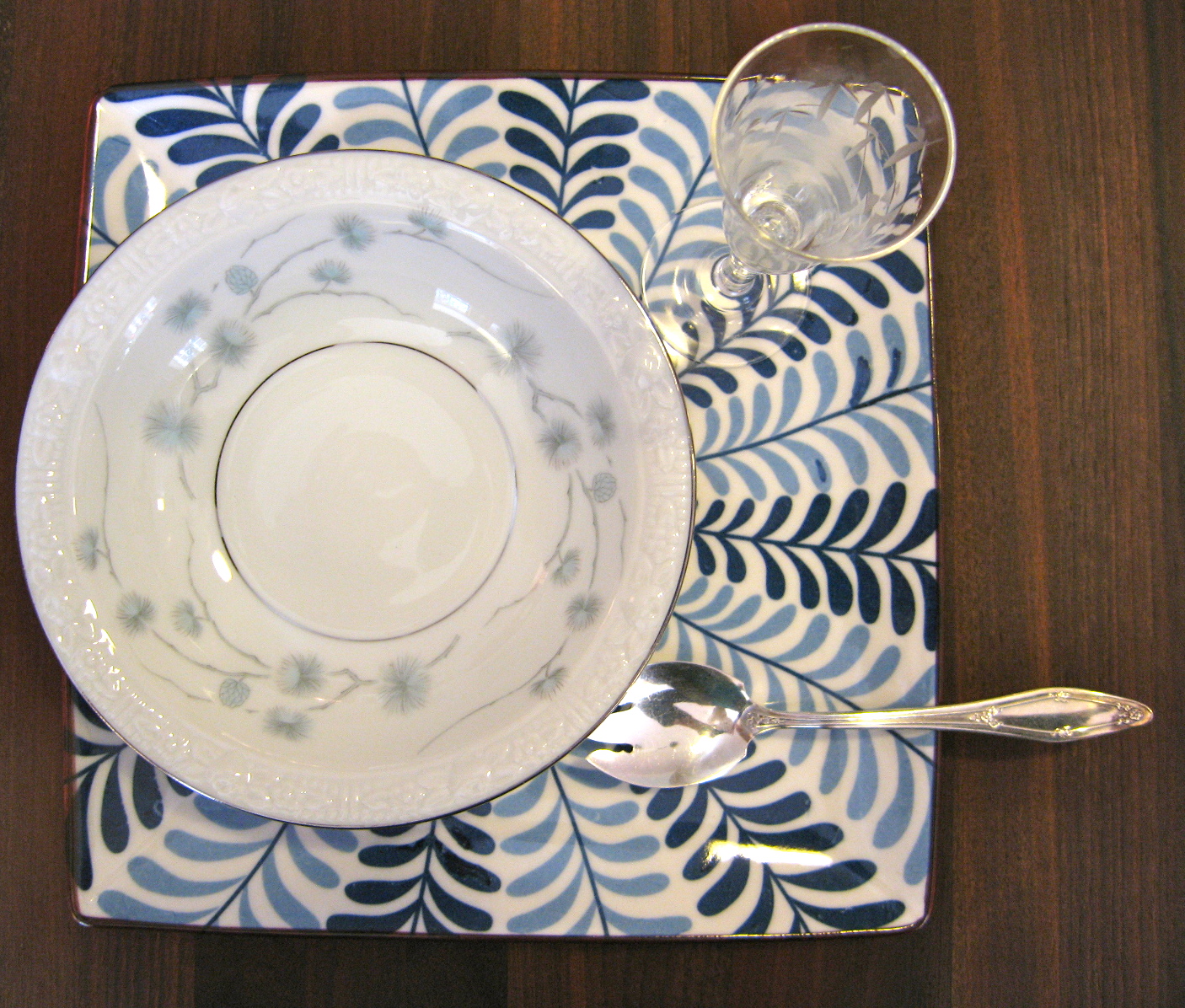
A square under plate updates this vintage desert bowl and ice cream spoon with modern flare.  The vintage cordial stem adds interest and fun when filled with a sauce or creme de menthe.

A large square plate used as a service or place plate is quite modern under another square plate.  The small vintage fan shaped plate is great for an appetizer and the crystal salter is large enough for a sauce.


The same square service plate works for this larger fan shaped plate (vintage snack plate with place for cup) and is perfect for a salad.  The egg cup works well for "dressing on the side."


A twelve sided vintage china plate sits nicely on the square service plate as well.  An Ikea double handled soup bowl helps make this setting special without seeming overly formal.


Round on round on round always works, and this up to date Calvin Klein cup, with no handles, and a saucer are a favorite of mine for a small soup serving.  The square napkin with geometric pattern further updates this setting with vintage platinum rimmed dinner plate used as a service plate.


The same saucer adds a touch of modern to this vintage 12 sided dinner plate when used as an under plate with a coffee cup for a soup course.


The saucer works for an appetizer with vintage cocktail fork and modern oval mini sauce dish.

A paper napkin in a square lucite holder sits nicely under a crystal finger bowl used for cold soup.  Even with fancy spoon, napkin ring and name card , the unexpected decreases the formality.


The combination of modern saucer, vintage gold demitasse saucer, vintage ice cream spoon, and vintage clover shaped ash tray (yes, cigarette ash tray) are perfect with a paper napkin to say "special desert" without looking old school.


The napkin, shown below, folded into a triangle and set under the soup bowl and on top of modern salad plate and vintage dinner plate gives this place setting a current appeal for a somewhat formal look.


Mixing a non-traditional into your table setting is an easy update.  Try a large dinner napkin folded into a square and set atop an unmatched plate on a vintage one.  There are many ways to bring vintage into today's world.  Try a salter for a mini sauce bowl, a bird Christmas ornament clipped to a name card placed on the plate instead of above it, and more.


Color and Pattern Can Do Amazing Things.

The silvers, grays, and whites of the setting above say soft and fancy.  The colors and the patterns of this setting shout special fun.

Below, the vintage mix of glass on modern plate, in a muted tone with no pattern, still says elegant. The mix plays down the formality of the white table cloth, crystal goblets and silver.

A mix of pattern and color can be playful, lively and informal, as seen right.


Mixing just a couple of patterns with less bold color and not as much contrast between colors makes for a more subtle statement.

Not so bold modern colors are easier to mix with vintage patterned multi-color china.


Finding current and modern pieces to use with what you already have can be a challenge.  


I was lucky to find a color called "ash" from Calvin Klein at a discount store.  The fact that these modern additions can be microwaved and are dish washer safe is icing on the not so old fashioned yet somewhat fancy and this is special cake!

The next post will pull it all together for a special Holiday table.