Showing posts with label Lighting. Show all posts

20 February 2012

Re-Purpose Re-Use and Green Stuff: For The Love Of Vintage Lamps


Reuse those old lamps.  They are a dime a dozen at flea markets, junk shops, and consignment stores as well as antique shops, yard sales, and online.  You can find one to fit just about any design or decorating project in any price range.

This lamp pair recently emerged from my closet making a debut in the master bedroom (an eBay find a couple of years back).  A new drum shade lifted them from their previous era and a large hand painted finial (from another vintage lamp) complemented and balanced the proportions of new shade and old lamp.  This lamp is tall, perfect for a cozy late night book reading session.


The detail is exquisite and the metal base adds texture and dimension to the bedside tables.


It was the casual carved look of this ceramic lamp pair that caught  my eye (in a Spencer, WV Antique Store) for a den project.  The den needed a lift without a major expense.  These lamps took on a very different persona once the old huge shades they came with were removed and traded for others from a previous consignment store buy.  An ivory elephant finial was a perfect topper.  One already had new wiring and the wiring on the other was in great shape.  


This old floor lamp had been in the family for years.  A new silk shade (a smaller shade than would have graced it originally) provides a soft light, without a big old heavy floor lamp statement, in an otherwise dark corner.  This old three way light can amp up to 200 watts of task lighting, if you need it, or hang out quietly using only 15 watts for a little night light atmosphere.


A $5.00 brass Stiffel lamp (a Roanoke VA flea market find) perks up with a new linen shade and new wiring.  The brass of the three-way lamp has mellowed with time befitting the gentleman who uses it next to his new not old Stickely leather chair.  A three way bulb allows for good reading light.   And, low wattage use is possible when the lamp is only needed for general room lighting.

This sweet porcelain rose bud lamp found on eBay brightens up a guest bedroom.  Although the cost was similar to lamps now found at major discount stores, the quality and craftsmanship of this lamp is superb.


This low cost Asian style consignment store find is also of very good quality.  It can handle a variety of shade styles and would work in just about any room.  Here is graces an antique chest of drawers.  However,  with a different shade it has also graced an entry hall table of a modern clean lined home.


Occasionally, at least for me, it is the lamp that catches the eye, inspires, and waits hiding in the closet until I dream up a project to surround it.  My most recent vintage lamp pair purchase from "The Designer Consigner" in Christiansburg, VA fits this category.


These are now hanging out with temporary shades in a bedroom waiting for more designer touches.  I know this lamp pair can be spectacular with the right shades and the right setting.  They were originally vases, possibly French from the late 1800 French Deco and Aesthetic style.  They were made into lamps many years ago with hand painted wooden bases and perfectly fitted metal caps with a harp.  The harps on these lamps are permanent and somewhat limiting of shade height.

I love the warm tones of the bird paintings and I am challenged by the pink deco design with black handles.  The warm painting behind and the rich wood of the dresser are already bringing this lamp back to life.  Ah, but it can have more energy and current design style than this.  I can hardly wait!  These are one of those finds that will inspire a complete room redo...

...and there are more great finds still waiting in the closet.

15 July 2011

Color and Other Design Horror Stories -

1930's Metal Furniture In A Guest Room Friends and Family Will Enjoy

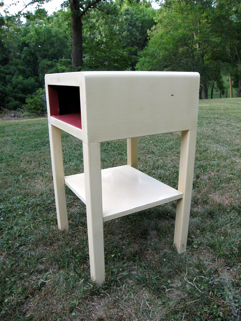
What was once very cool and even, awesome, can be quite the opposite some years later.  Take for example these two metal side tables.  They spent their first years as trendy metal furnishings with a painted blond wood "look" that was quite the rage of the times.  You see them here in their second life having been used by different owners and painted light colors.

Using these today, as is, even if they were the now famous designer pieces which they are not, for bed side tables in a guest room  would qualify as a Color or Other Design Horror Story, for sure.  But that is the point, exactly.  Color and Design can take the horror out of the story.

Metal, old looking office furniture type pieces don't have a rightful place in today's spa-inspired oasis bedrooms.  However, these pieces have nice clean lines and they are sturdy enough to handle anything a guest might set up on them -including themselves.

The challenge was deciding how to alter the look and use them in a guest room.  A paint job made to look like wood didn't do much for them the first time around and probably wouldn't now.  However, textured paint in a rich deep color went a long way in altering the flat metal  antique file cabinet effect.  We used a hammered metal look spray-on paint in dark brown.


Adding a bit of whimsey and a more current style, we painted silver stripes over the top and sides.

These pieces never had a drawer.  Painting the interior dark brown blended it without calling too much attention to it, providing easy access for a book or magazine.


Since individual pieces are rarely viewed alone in a space, soft furnishings, textures, color, pattern and other design elements can be used to balance and harmonize.

 In this space, the brown stripes and legs of the table repeat the dark shape of the floor lamps.  The silver repeats the silver of the base of the lamps and balances soft warm gold colors found throughout the space.  The cool silver also bounces some light into the space and at the bedside from the windows.  The dark brown of the tables play off the leather headboard nicely and the stripes keep the pieces and the space from seeming too heavy with brown furniture.

This bedroom is over a garage with it's own private stairway and bath.  We wanted the space to maintain a sense of hidden surprise (as stairs and all are well hidden from the rest of the house) while being inviting with comfortable unexpected country elegance.  Spa-like settings provided some inspiration, however, this bedroom reflects the rambling interior architecture of the home and its country surroundings.
The tables are small and the stripes add interest to the tops, they don't require much in the way of accessories.  A simple water pitcher and/or fresh flowers reveal an interest in the comfort of the occupants.  Uncluttered surfaces leave respectful places for their things during their stay.

Items that are personal to the home owners, in a guest space, can sometimes make guests feel as though they are imposing upon personal territory.  Using a spa as inspiration for this space helped keep the focus on the guest.  Spas are for the client.  When there are extra rooms available for overnight guests -they should be for the guest.    They should be inviting and comfortable and not too fussy, assuring the stay is memorable for all the right reasons.


06 May 2011

Specific Requirements: Kitchen Remodel

We all like to save money and we love nice new kitchens.  These don't necessarily go together.  Sorting  priorities is a good way to keep the cost down.  A recent high end rental project, for a house that was stuck in the current bad economy and low Florida housing market, tested my abilities for "specific requirements" while utilizing existing spaces for new appliances and a luxury kitchen feel.

First, a list of things in the existing kitchen that were in good enough shape to keep:  tile floor; granite counter tops; tile black splash; wall/ceiling paint; and ceiling pot lighting.  Keeping the back splash tile and granite tops meant keeping the base cabinets and if possible wall cabinets.

The things that had to go:  original oven and microwave stack; dish washer; small older mediocre electric cook top; and original 48 inch range hood that vented to the attic.

Things that had to be brought up to code:  water line for fridge/freezer ice maker; vented or proper recirculating hood to match cook top; raising of hood to meet current code heights; and circuits/amperage for new appliance needs.

The cabinets were original to the early 1980's house and the dark wood had been painted white once.  The cabinet doors and drawer fronts had been replaced with cheap vinyl that was beginning to yellow and peel.  The interiors of the cabinets, both base and wall, were showing their age and were not appealing to high end renters or buyers.

The proposal: remove all major appliances including a five year old counter depth side by side fridge/freezer plus cabinet doors and hinges  and drawer fronts along with drawers and old slides. New cabinet floors would be placed in the sink and cook top base cabinets.  New shelves and shelving hardware for upper cabinets and new drawers and slides for the base cabinets.  All cabinet boxes would be cleaned and sanded and spray painted in place inside and out.  New door and drawer fronts would be ordered and spray painted to match at the kitchen contractor's shop.  Concealed hinges would be used for the new doors.  Existing round black knobs would be kept for doors and new black bin pulls added to drawers. A new base cabinet with granite top to match existing would replace an old bookcase and new cabinet doors would cover existing open corner base shelving.  Trim molding would be added to the wall cabinet tops.

New appliances were to include: a larger energy efficient cook top that did not require a hole through the roof for venting;  a larger energy efficient fridge/freezer with ice maker; a top of the line energy efficient dish washer; an energy efficient recirculating range hood, and an upper end microwave and oven.

The "specific requirements" were:  27 inch wide for ovens; 36 inch wide for fridge/freezer and height not over existing wall cabinet tops; 34 inch max height by 24 wide for dish washer; and adjusting and adding wall cabinets and smaller hood to fit 48 inch space from old hood.  Any changes in appliance door sizes, swings, and drawer pull outs had to be checked with existing spacing within the kitchen.

Weigh the cost of changes, including labor, versus end results for look and function.  An energy efficient 36 inch Thermador induction cook top was sourced that did not require a vent to the outside. Wall cabinets above the old hood were removed with the hood and a 42 inch very quiet stainless steel Braon recirculating hood was purchased.

Thermador made a 27 inch, high end oven with microwave and warming drawer all in one piece that was cheaper than 27 inch stacks without the warming drawer from other vendors.  This meant loosing the cabinet drawer below the existing oven space  -worth it.  Luck enabled us to access plumbing through the back of the oven cabinet to put water into the attic and back down to a cabinet beside the fridge/freezer space for the ice maker  -no open drywall to patch! The upper cabinets were removed from the existing fridge/freezer space to allow for a taller Bosch built-in one.

Always check with major appliance stores and manufacturer web sites for sales and deals.  With our purchase of the cook top and ovens we got a dishwasher for free.


The Completed Project.  We added pull out spice racks to each side of the new hood to cover the rough wood where the old hood was attached.
We added larger wall cabinets above the new hood to the ceiling and wrapped the ceiling cornice giving some height to the look of the kitchen.  This covered all the rough dry wall from the tear out. The 36 inch door and drawer of the new fridge/freezer were large so we used custom cabinet fronts to blend it in and keep it from looking too monstrous.

Wall cabinet top molding provided a more finished and quality look.  The doors on the corner base cabinets did the same.  And, the new base cabinet by the patio/porch doors provided extra storage while tying that end of the kitchen in with the rest, making the kitchen seem larger.

This remodel completed in less than a month allowing a fast rental. Michael and his crew at MMKB Countertops were focused and on time with this project.

To save money focus on what must be done. Then, balance money spent for what you will get and always include labor costs in decisions. Be careful not to remove existing value and don't assume everything must be replaced.

27 October 2010

Design Finds One of a Kinds Trash or Treasure - Antique Lamps and Pencil Drawing

Italian Antique Lamps and a contemporary Russian Pencil 'Study' frame a Thomas O'Brien Collection Sofa in an American Colonial Style Home...Juxtapose!

Many years ago I was a guest in a private home in Loussane, Switzerland.  This was a  large modern town home with more sprays in the shower than American manufacturers have thought of to date.  But what struck me most was the juxtaposition of antiques, art, modern, and whimsy in the main living space.  Imagine museum quality historical oil paintings with Mid-Century lamps, sectional sofa, an over-sized porcelain tennis shoe, museum quality antiques, small religious paintings, and a leather love-seat in the shape of a baseball player's catcher's mitt.

The whole idea of this type of harmonious existence with such extremes in style excited me.  It made me feel alive, current yet connected to the past, serious, and at the same time ready for fun.  What a fete!  As an interior designer, I now love mixing it up and don't even blink when my clients tell me of their diverse tastes and requirements.


The common knowledge of how colors can pull things together is at work in these project photos.  The greens of the cushions, couch, and lamps are close in hue (actual color) with variance in darkness to lightness and also the intensity of the color.  So they work well together even though the greens are not an exact match. The rust color of the more traditional pattern cushion, the fringe of the brighter green cushion, and the oranges and yellows in the lamps are close to red on a color wheel which is opposite green and therefore a contrast with green.  You can often "slide" to close colors when choosing items and this will give a more complex harmony. This is not quite as simple as it sounds.  It helps to use a good color wheel or better yet have an understanding of a three dimensional color theory such as the Munsell Color System and to have a color scheme in mind.

The couch is actually similar, in light to darkness, to much of the gray in the pencil drawing and the frame itself.  This is called light to dark value and it is likeness in value that helps this clean lined couch look nice beneath the more elaborate drawing and frame.  But it is not color that relates the lamp to the drawing, it is pattern and repeated elements.  There is a busyness and luxurious fullness in pattern to both so they are alike in their forms, both within the lamp and drawing and of the lamp itself with elements in the drawing.


The couch is also a contrast in style to the drawing and lamp.  Opposites will often balance and look nice together.  The style of the end table/bookcase is the same as the couch, working the same way with the lamp and drawing.  The dark gray of these can be found in the drawing as well, again pulling color to help with the harmony.  Dark colors are very grounding and the end table/bookcase help ground everything and make all parts seem connected to the larger whole.

It is the 'unfettered' six over six colonial style windows that work with the clean lines of the sofa and couch.  Still, we see them as traditional windows fitting in style to the urn shape of the lamps and the style of drawing and frame.  The clean lines of the window, trim and mullions as well as the rectangle shapes relate to the end table/book case and the couch in shape and form.  The nubby texture of the couch is in contrast to the smooth finish of the drawing glass and the slick surface of the end table/book case but in likeness to the lamp as the holes and cutouts give the look of a pebbly texture.

As for whimsy, well, it doesn't have to shout whimsy.  Take a look at the books, Encyclopedia of Southern Culture, Ants...the small dog, an antique demitasse cup and saucer, a bright silk cushion with long fringe

It is rarely one thing that will make a space harmonious.  Sometimes there are so many elements at play that it is mind boggling.