25 December 2012

Off The Wall And Special Things: Antique Dining Furniture Update


It isn't easy using large antique furnishings in today's dining rooms while staying current and stylish.  Refer to my blog post of September 2012, Specific Requirements: Antique Dining Furniture, as this post is an update of that earlier project.

An appraisal was done on the project furnishings, pointing to the appropriate decision of cleaning, touching up and repairing.  Complete refinishing would have lowered the value.

Using the design path created in the above blog post, I carefully chose lighting, fabrics, and accessories to work with my old behemoths, the original rug and colors of other areas on the main floor of the house.

The chair seats got a large current pattern fabric in a neutral tone, Riad Dune.  Lined curtains were placed in front of the bay window area on a dark wood rod.  The dark wood relates to the dark dining furnishings and the curtain fabric is of a large modern sized toile with a brown background in a Linen and Rayon blend.  Placing the curtains in front of the bay allows for optimum vertical height.


The formality of the silver chandelier was toned down by using dark natural linen shades.


Large retro style lamps fit the scale of the dining pieces and bridge the gap between today and the early 1900's of the furnishings.

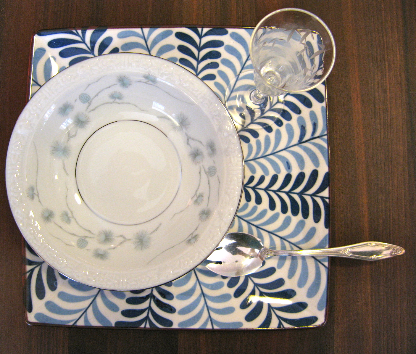
Wooden bowls, boxes, baskets, and a mixture of vintage and modern table settings help to make the room less formal and more current with today's trends, without trying to make the furnishings be other than what they are.

The walls were covered with a textured green fabric, an updated colorful grass cloth look.  The green color works with the rug, furnishings and accessories of the adjacent room as well.


The dark background curtains help balance the back of the space, where there is a lot of light from the windows, with the front of the space where the large buffet is placed (it is on the left, not seen in the above photo).  The server that is seen on the right, in the back of the photo, also helps to balance the larger buffet, not shown.  The five foot diameter round table is in the middle of the space under the chandelier.  The table can seat eight without the addition of leaves.  Yet the room still feels spacious and inviting.

The server and buffet are placed on opposite corners in an attempt not to crowd the table and traffic flow around it, refer to the above mentioned blog post for the space requirements.  New mirrors above these two large pieces help lighten these areas and give a feeling of more space around them.  The larger mirror is used over the smaller server piece, giving it a larger sense of scale and helping balance the opposite larger buffet.


The bay window area is the perfect spot for the large lazy suzan style silver serving piece.  The buffet is too high for this piece.   Placed on the server furniture it sticks out into the room, crowding the table and chairs.  This permanent display solved a storage issue as the piece is 34 inches in diameter.

Although the original plans and design path called for the addition of a china cabinet, once the project was underway it was thought to be too much furniture.  Using the bay area for the lazy suzan server was adopted as a new option for the plan.


While the silver tea set kept its original spot on the buffet  -small hand painted antique tiles with neutral colors, dried hydrangeas in a silver bowl, a tiny carved wood trinket box, large retro style lamp with dark natural linen shade, and amber candle holders maintain an elegance without being overly formal.


Mirrors still need to be hung and art work chosen.  The art and wall hung pieces have to work hard in this space to maintain the balance of old and current.  It is worth waiting for the perfect pieces to come along or be commissioned.  The design path set forth in the earlier blog post stated that art of a personal nature be used.  Art placement may also make a difference on the exact placements of the mirrors, they will learn against the wall for now.

Although the art part of this project has not been completed, the room is certainly ready for use.  Further detail can be added to this space and any space at any time.  Some changes can be made without disrupting the style and sense of the way it is now.

Look for a future blog post on the three phases of a space and how some people like to live with phase I while others move on to phase II and still others like the highly detailed spaces full of character and objects found in phase III.

This photo is of the completed space with art and mirrors hung.  See more photos of the room
on the Houzz web site.

02 November 2012

Color and Other Designer Horror Stories: Fancy Table Settings

Most likely, we can all relate to a Holiday or fancy occasion meal where it wasn't the food that went wrong.   Colors that don't work well together, seasonal pieces that are past their prime, and odd pieces that just don't seem to fit today's world can take some of the special out of any occasion.

 An enjoyable table setting will be harmonious with all it's parts and pieces.

Here is what you can do to prevent your event from becoming another horror story.

For starters:  Know the basic china, silver, and glassware that you have on hand to work with.


Sure this sounds simple, but how many of you really know what you have stuffed into your cupboards over the years?  Or, what pieces broke way back when?

A good way to know what you have is to pull it out and photo it.  List how many of each.


Doing this, I discovered I have three china sets for special entertaining.  One set is a complete set for twelve, shown top left.  Another is complete for 5, but there are 12 small bowls, cups and saucers and 8 dinner plates (shown right).  The other is for 20, except for one plate.


I have eleven green with gold soups and 12 saucers.  I have 12 green with gold demitasse sets.  I have 8 gold demitasse sets.  I have salt dishes, butter pats, relish plates....

Who uses all this stuff?

What I needed to know, and what you need to know, to quickly deal with the basics of what's on hand and get on to making our tables fabulous are: What colors and what shapes work well together?  If doing a dinner for eight what are the options?  If service is required for six or for twelve?  What if it is a basic three course? Or, a fancy seven course?  What can demitasse sets be used for?  Is there another use for shot glasses?  What about those tiny "liquor" stemmed glasses?  Is there another use, other than that first intended, for the other oddities we can't seem to get rid of?  And, what can be added to make our table settings look more up to date?

Lets talk Shapes.

Most china is round, no problem.  However, there are squares, ovals, rectangles, octagons and even twelve sided, as shown in two of my sets above, and more.  Circles, or rounds, dominate a design.  Placing a round on top of another shape will work depending on their sizes, and vice versa.  A good rule of thumb is smaller rounds on top of larger other shapes and same size or smaller other shapes on top of rounds.   Experiment, if you have varying shaped pieces.

When it comes to glassware, shapes can work hard for harmony or subtly, yet mightily, work against it.  When placing different shaped glasses next to each other note the negative space between the "bowl" of the glasses.  Is the space between the glasses pleasing, like the two different glasses shown left?

Is the shape the same, such as these cobalt glasses?  Are the patterns alike, or close, such as in the cut and etched design above?


Shapes are important.


A square under plate updates this vintage desert bowl and ice cream spoon with modern flare.  The vintage cordial stem adds interest and fun when filled with a sauce or creme de menthe.

A large square plate used as a service or place plate is quite modern under another square plate.  The small vintage fan shaped plate is great for an appetizer and the crystal salter is large enough for a sauce.


The same square service plate works for this larger fan shaped plate (vintage snack plate with place for cup) and is perfect for a salad.  The egg cup works well for "dressing on the side."


A twelve sided vintage china plate sits nicely on the square service plate as well.  An Ikea double handled soup bowl helps make this setting special without seeming overly formal.


Round on round on round always works, and this up to date Calvin Klein cup, with no handles, and a saucer are a favorite of mine for a small soup serving.  The square napkin with geometric pattern further updates this setting with vintage platinum rimmed dinner plate used as a service plate.


The same saucer adds a touch of modern to this vintage 12 sided dinner plate when used as an under plate with a coffee cup for a soup course.


The saucer works for an appetizer with vintage cocktail fork and modern oval mini sauce dish.

A paper napkin in a square lucite holder sits nicely under a crystal finger bowl used for cold soup.  Even with fancy spoon, napkin ring and name card , the unexpected decreases the formality.


The combination of modern saucer, vintage gold demitasse saucer, vintage ice cream spoon, and vintage clover shaped ash tray (yes, cigarette ash tray) are perfect with a paper napkin to say "special desert" without looking old school.


The napkin, shown below, folded into a triangle and set under the soup bowl and on top of modern salad plate and vintage dinner plate gives this place setting a current appeal for a somewhat formal look.


Mixing a non-traditional into your table setting is an easy update.  Try a large dinner napkin folded into a square and set atop an unmatched plate on a vintage one.  There are many ways to bring vintage into today's world.  Try a salter for a mini sauce bowl, a bird Christmas ornament clipped to a name card placed on the plate instead of above it, and more.


Color and Pattern Can Do Amazing Things.

The silvers, grays, and whites of the setting above say soft and fancy.  The colors and the patterns of this setting shout special fun.

Below, the vintage mix of glass on modern plate, in a muted tone with no pattern, still says elegant. The mix plays down the formality of the white table cloth, crystal goblets and silver.

A mix of pattern and color can be playful, lively and informal, as seen right.


Mixing just a couple of patterns with less bold color and not as much contrast between colors makes for a more subtle statement.

Not so bold modern colors are easier to mix with vintage patterned multi-color china.


Finding current and modern pieces to use with what you already have can be a challenge.  


I was lucky to find a color called "ash" from Calvin Klein at a discount store.  The fact that these modern additions can be microwaved and are dish washer safe is icing on the not so old fashioned yet somewhat fancy and this is special cake!

The next post will pull it all together for a special Holiday table.


21 September 2012

Specific Requirements: Antique Dining Room Furniture

Antique dining room furnishings can be rather large.  Fitting these old behemoths into a decent sized dining space is challenging to say the least.  How on earth does one bring them and the dining room into this century?  A current project attempts a path.


While admiring the skills of the early 1900's American furniture designer, John D. Raab, I'm swearing at clearances needed for chairs and serving and drawing a blank on an updated inspiration.
Think buffet, server, 10 chairs and an expanding 60 inch round table that will be used with various numbers of leaves in place.  The china cabinet got lost somewhere in history.  The furniture is in need of repair and finish restoration.


It is hard to know where to begin with a project like this.  
But, you can always start by sorting out the specific requirements.

Requirement 1, fixing and fitting it all in:  I documented dimensions of furnishings and the room itself.  I noted outlets, lighting, windows, heat vents, traffic flow into and out of the room and how the traffic circulated on the rest of this floor.  I carefully checked for needed repairs and the condition of the original finish.


Requirement 2, how the space is to be used:  I made sure I knew how the space was to be used and how often.  Then, I checked to see what was needed to use the space the way it is intended.

Requirement 3, bringing the room into this century:  Not only does the space need to be updated somehow, it needs to fit the client's definition of updated and current.  The rest of the house has a mix of antiques, contemporary art, and an assortment of clean lined styles.

Requirement 4, understanding the need and wish of specific feel or character for the space:  Obviously the old furniture is important.  Other accessories and objects in the house were collected on travels and from places of residence.  The table service is a family heirloom and there is a wish for younger members to enjoy and learn to appreciate it.  A space where all family and friends will feel special and possibly connect to the space in a personal way is desired.

Requirement 5, colors and textures or other elements of design important to the space:  The rug stays and other colors found in the house flow and cross over from room to room.  New window treatments and chair seat cushions are needed.  Some kind of wall treatments or art with a personal connection to the family is wanted.  A desired mix of old and new is apparent.

The requirements come together in a plan for the space:

Requirements 1 and 2:  There is to be large and small entertaining in the space, both sit down and buffet, sometimes all in the dining room, sometimes the family and guests will be free to roam.  The space will only be used for dining and entertaining with food.


There is one full wall and one partial wall (walls without windows and doors) to work with and the window view is important.  Darn if there isn't a central vacuum connection in the middle of the partial wall.  One wall has the double door entry and opposite this was a wide bay window.  The partial wall space was at the window end of the room with the door to the kitchen on the other end of this wall.

Specific Requirements Often Dictate Floor Plans

Getting to the buffet from the kitchen while guest are seated is a requirement. Using the buffet for buffet style entertaining where guest come and go from other rooms is also important.  Ah ha!  Put the buffet where it is the easiest to get to from the kitchen AND the main dining room entry.

The dining table is five feet across, no matter which way you turn it.   The table should be situated where guests can easily move their chairs back and go to the buffet or server.  We also need room to walk around the table while guests are seated.  The table will seat 8 without any leaves and will be used for more than 8 once or twice a year.  That darn central vacuum connection!  Can we move that center chandelier!  And darn it,  a china cabinet would be useful, but where would it go?

The server is not so large and is open at the bottom making it feel lighter.   This is a good thing as there is only one place for it if a china cabinet enters the space, the bay window.  Both the buffet and server housed on the same wall would be too heavy feeling on one side of the room.

Even with the server in the window, the round table can be placed back further into the room, leaving the forward space for serving and gathering areas.  The chandelier can be moved further back into the room to hang over the table center, but it will require pulling new wiring from the switches.  The central vacuum hook up can be moved using the basement access.  A slim depth, wide and tall china cabinet will balance the large buffet while leaving room for seated guests and roaming guests.

The server will go on the partial wall until a china cabinet is fabricated.  

Floor plan done.

Budget Dictates Materials and Finishes

Other variables may also influence how and where money is spent.  This furniture finish is varnish.  Restoring the pieces to their original look with the original finish treatment and using repair materials that are to the period of the pieces are a big deal and expensive.  The restoration folks recommended an appraisal of the pieces to help make the decision of 'full to the period restoration' or 'partial' or just 'repair and touch up.'

Issues or problems are often opportunities

Okay, what about the need for a china cabinet? After research and thought, many of the available styles of china cabinet would be out of place in this space.  A piece from this collection or something close has not been found via antique stores, online, and auctions.  This is an opportunity for a custom designed piece that works with the original collection but has clean lines with an updated feel while sitting closer to the wall than the original would have done.

Requirements 3, 4 and 5:  The classic oriental style rug has to stay, but we can pull colors from it.  The rug already works with the colors, furnishings, and accessories in the rest of the house.

Use the new stuff to meet requirements not met otherwise

The rug and the furnishings give us the old world appeal.  The possible new custom china cabinet as well as the fabrics of the window treatments and seat cushions are the starting points for new world and updated style.

Fabrics can be expensive and custom draperies for large windows can eat your lunch.  Luckily this space has a window view that we don't want to hide.  The bay window area has a lower ceiling than the rest of the space so a feeling of height at the windows is important to stay in scale with the rest of the room and furnishings.  Simple vertical panel style window treatments with minimal fabric fits the requirements.  This style of treatment and vertical feel will help guide fabric selections.

Additional lighting and accessories are also ways to bring in more modern elements.

The architectural reality of a space often dictates design elements and style

Hmm, that friend and family personal connection requirement?  And, the updated wall treatment or art?

These are major projects themselves.  I've combined these requirements  into one inspiration and you can read all about it in the article I wrote for Plinth and Chintz,  Road Trip to Rome for Project Inspiration.  You will find the link on my Articles and Link Page above.

A design path is established!  Accomplishing all this and keeping the character of the room soft, inviting, unpretentious, and peaceful will be an ongoing challenge.  Stay tuned for more on this project.


26 March 2012

Design Finds One of a Kind Trash or Treasure: Frame It Up!

Wall Art is a wonderful way to put style and personality into a room.  If it speaks to you in some way and makes you feel good, it will fill your interior space with a sense of you as well.

Big or small, framed art can play a huge part in interior decor.  And, it isn't just the large items that can make a statement.  Small items can be made to look important and larger ones can provide a back ground for other more dominant design elements.

This small water color, found in a Dallas Antique Store, reminded me of stories told to me by original residents and house keepers of the Swiss Avenue Historic District where I once lived.  The water color was found in the attic of an older home.  On the back it is titled, "Portrait of Mattie Carter, washing clothes in the garage, August 13, 1930, by Margaret Hardie."  I paid a couple of dollars for the piece and had it famed to look important as I felt it captured an important behind the scenes history of those neighborhoods.

The deep frame gives the art depth and adds to the sense of looking into the deeper space of the garage.  The gold of the frame perks up gold tones of the old unfinished wood garage walls as well as Mattie's straw hat.  The swirls of the ornate frame bring out the swirls of the garden hose and old metal tub.  It all works together to add a touch of elegance to the art and makes a statement with this simple washing day scene.

Another cheap favorite from the same Dallas artist is titled, "Impressions at a Country Dance Hall, Glen Rose, Tx."  This piece is playful, simple, and nostalgic. I had it framed to make it seem larger, but kept the feeling overall light and airy and fun.  An interior mat frame gives the art itself more prominence within the larger piece and is whimsical with its barber pole like swirls.  When I look at this I see numerous old Dance Halls across Texas and in particular, The Sons of Herman Hall in Dallas, where I first appreciated the music of The Dixie Chicks.

Professional framing can do amazing things to art.  However, not all of them have the ability to get the best possible effect from your art.  Shop around and have them show you what they think will look nice. Choose a framer with a good eye for detail within the art who can find framing and matting to work with the art, pulling it altogether.


This Japanese Block Print, found by my husband in a shop in Kyoto and stored for years unframed, is a good example of a skilled framer's work.  The antiqued silver frame picks up on the charcoal of the print background.  The inner mat frame of the same finish sits back from the art giving the heavy dark piece some room, lightening the feel.  The artist's pencil signature and print number are visible.  The light off white matting also helps to lighten the dark heavy piece, letting the lighter aspects of the flowers connect visually to the larger  frame.  But it is the detail of the frame that pulls it all together.  The carved flowers of the frame repeat the shapes of flower petals found within the art piece.

Just as with good interior design, repeated elements of framing and art work together for a greater harmony.

So, no, not any old frame will do!  Frames as well as matting are important and can make or break the effect of the art.  Although professional framing can get pricey, there are lots and lots of frames available that you can choose and put together with your art, yourself.


The intense play of this child was captured on film.  I searched and searched for a frame that would highlight and work in harmony with this photo.  The light shines and reflects in her hair, making her seem almost angelic while playing in the mud.  The inexpensive frame I found also reflects light, highlighting the effect of the photo.  The dimensional swirls of the design of the frame seem to flow along with those messed up baby curls.  And, they keep the whole piece playful.


I found these quite small vintage colored engravings at a boutique gift shop.  They were too lovely to pass up  at five for $18.00.  Someday the five will probably be professionally framed but for now I use them with frames I found for $1.00 each.  These blue, gold and silver metalic frames were a steal with the mat and interior mat frame included.  I like how the silver and blues pick up on colors and shapes in the art.


At $1.00 each, I had to buy these brown frames as well.  They were great for adding oomph with their expensive looking wood and gold trim.  They made these fashion pencil drawings seem more like art without overdoing it.  And, they picked up on the warmth of the faded old paper.


The plain black metal frame is all that is needed for this black and white block print.  The strong simple lines of the print background columns stay strong with the small black frame.  The circles of the bicycle wheels, although small within the print size, draw your eye to them.  The curves of the umbrellas relate to the circles, this along with the reflected light from the umbrella tops keep the bicycles and their riders from being overpowered by the strong dark columns and light open spaces.

It is the frame that made this abstract print one that I would hang.  The piece itself is a bit too much for me, too sharp, too strange.  Yet, the frame balanced it out by pulling shapes as well as light and dark angles from the art piece and surrounding it.  It is still edgy and abstract, but more balanced. This piece is large and great for hanging in a hallway or wall that is off by itself.

We all have different tastes and some of us like a mix of art styles and types.  If you like it you will probably be able to find a place for it.  If you love the art but not the frame or matting, take it to a framer or try some new frames and mats yourself.  If you love the frame but not the art, find something you like better that will work with the frame.


The ornate frame of this piece (found at my local "Designer Consigner" store in Christiansburg, VA) caught my eye.  I looked and looked at it, putting it down and walking away several times.  Both the frame and the small oil painting are nice.  They seem to work together.  But that is it, they are both working hard for attention.  The piece is busy and the art is busy.  The eye seems to go back and forth.  I bought two of them.


I had a lovely little 1940's water color postcard from the Isle of Capri that I found in an Uncle's old scrap book, I thought I would give it a try in the ornate frame.  The frame is still beautiful and ornate, yet it seems to surround the little water color without competing with it.  The frame color is repeated in the deck and chairs and clothing found in the art.

Certainly the white mat contrasts with the frame drawing the eye toward the art, maybe a bit much of contrast. An off-white mat or light neutral might work better.

Both these art pieces look nice with the ornate frame.  I love the little water color and wanted to highlight it for my own enjoyment.  This frame and light matting lets me see it and appreciate it.  I have another water color postcard, so the wheels are turning and I am off to find the perfect frame for the two oil paintings I removed from the ornate frames.

Put your style and personality into your spaces.  Take the art you like and frame it up!