
 Big or small, framed art can play a huge part in interior decor. And, it isn't just the large items that can make a statement. Small items can be made to look important and larger ones can provide a back ground for other more dominant design elements.
  This small water color, found in a Dallas Antique Store, reminded me of stories told to me by original residents and house keepers of the Swiss Avenue Historic District where I once lived. The water color was found in the attic of an older home. On the back it is titled, "Portrait of Mattie Carter, washing clothes in the garage, August 13, 1930, by Margaret Hardie." I paid a couple of dollars for the piece and had it famed to look important as I felt it captured an important behind the scenes history of those neighborhoods.
 The deep frame gives the art depth and adds to the sense of looking into the deeper space of the garage. The gold of the frame perks up gold tones of the old unfinished wood garage walls as well as Mattie's straw hat. The swirls of the ornate frame bring out the swirls of the garden hose and old metal tub. It all works together to add a touch of elegance to the art and makes a statement with this simple washing day scene.

 Another cheap favorite from the same Dallas artist is titled, "Impressions at a Country Dance Hall, Glen Rose, Tx." This piece is playful, simple, and nostalgic. I had it framed to make it seem larger, but kept the feeling overall light and airy and fun. An interior mat frame gives the art itself more prominence within the larger piece and is whimsical with its barber pole like swirls. When I look at this I see numerous old Dance Halls across Texas and in particular, The Sons of Herman Hall in Dallas, where I first appreciated the music of The Dixie Chicks.
Professional framing can do amazing things to art. However, not all of them have the ability to get the best possible effect from your art. Shop around and have them show you what they think will look nice. Choose a framer with a good eye for detail within the art who can find framing and matting to work with the art, pulling it altogether.

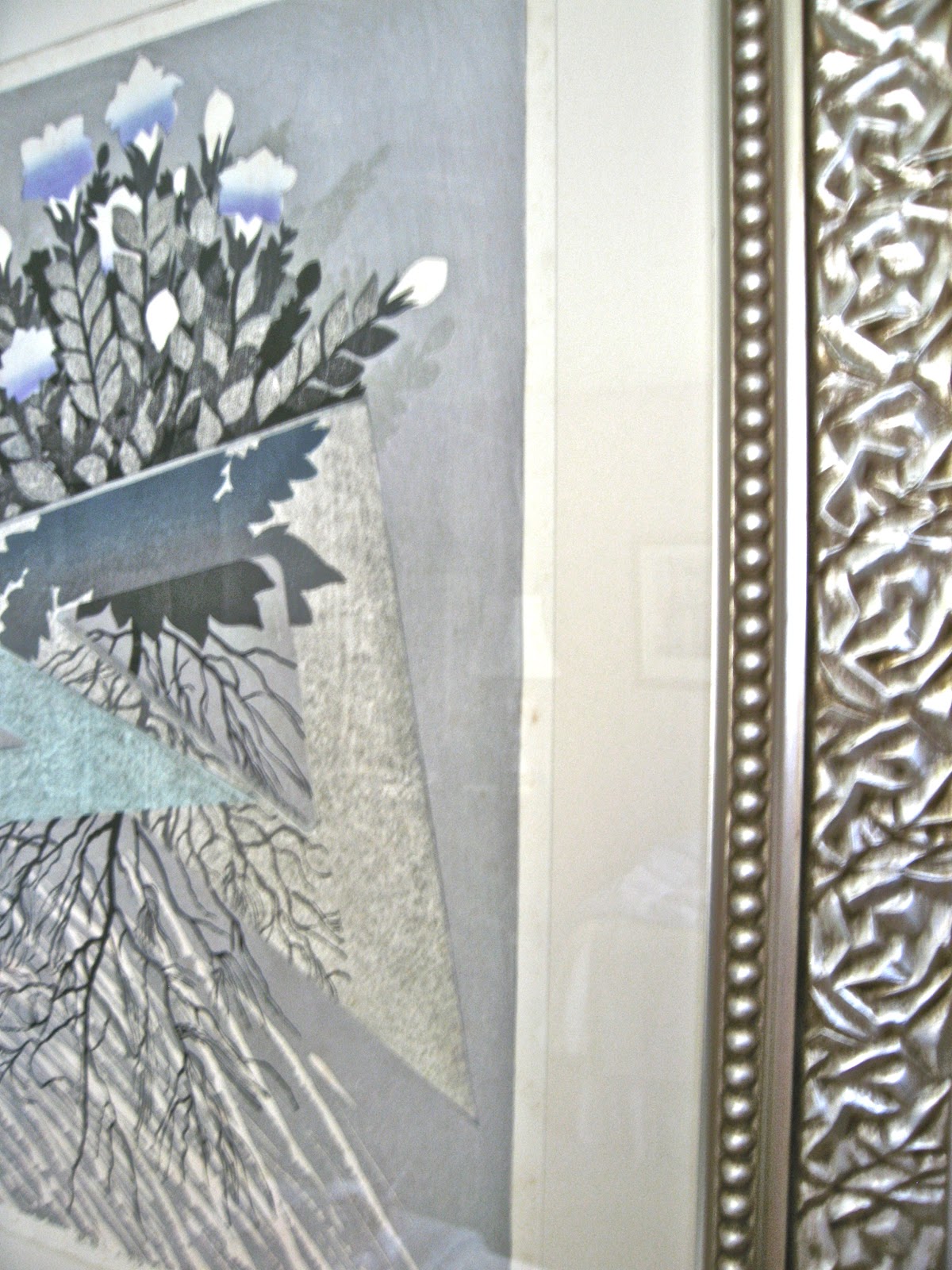
This Japanese Block Print, found by my husband in a shop in Kyoto and stored for years unframed, is a good example of a skilled framer's work. The antiqued silver frame picks up on the charcoal of the print background. The inner mat frame of the same finish sits back from the art giving the heavy dark piece some room, lightening the feel. The artist's pencil signature and print number are visible. The light off white matting also helps to lighten the dark heavy piece, letting the lighter aspects of the flowers connect visually to the larger frame. But it is the detail of the frame that pulls it all together. The carved flowers of the frame repeat the shapes of flower petals found within the art piece.

So, no, not any old frame will do! Frames as well as matting are important and can make or break the effect of the art. Although professional framing can get pricey, there are lots and lots of frames available that you can choose and put together with your art, yourself.

The intense play of this child was captured on film. I searched and searched for a frame that would highlight and work in harmony with this photo. The light shines and reflects in her hair, making her seem almost angelic while playing in the mud. The inexpensive frame I found also reflects light, highlighting the effect of the photo. The dimensional swirls of the design of the frame seem to flow along with those messed up baby curls. And, they keep the whole piece playful.


At $1.00 each, I had to buy these brown frames as well. They were great for adding oomph with their expensive looking wood and gold trim. They made these fashion pencil drawings seem more like art without overdoing it. And, they picked up on the warmth of the faded old paper.

The plain black metal frame is all that is needed for this black and white block print. The strong simple lines of the print background columns stay strong with the small black frame. The circles of the bicycle wheels, although small within the print size, draw your eye to them. The curves of the umbrellas relate to the circles, this along with the reflected light from the umbrella tops keep the bicycles and their riders from being overpowered by the strong dark columns and light open spaces.
We all have different tastes and some of us like a mix of art styles and types. If you like it you will probably be able to find a place for it. If you love the art but not the frame or matting, take it to a framer or try some new frames and mats yourself. If you love the frame but not the art, find something you like better that will work with the frame.

The ornate frame of this piece (found at my local "Designer Consigner" store in Christiansburg, VA) caught my eye. I looked and looked at it, putting it down and walking away several times. Both the frame and the small oil painting are nice. They seem to work together. But that is it, they are both working hard for attention. The piece is busy and the art is busy. The eye seems to go back and forth. I bought two of them.

 I had a lovely little 1940's water color postcard from the Isle of Capri that I found in an Uncle's old scrap book, I thought I would give it a try in the ornate frame. The frame is still beautiful and ornate, yet it seems to surround the little water color without competing with it. The frame color is repeated in the deck and chairs and clothing found in the art.
 Certainly the white mat contrasts with the frame drawing the eye toward the art, maybe a bit much of contrast. An off-white mat or light neutral might work better.
Both these art pieces look nice with the ornate frame. I love the little water color and wanted to highlight it for my own enjoyment. This frame and light matting lets me see it and appreciate it. I have another water color postcard, so the wheels are turning and I am off to find the perfect frame for the two oil paintings I removed from the ornate frames.
Put your style and personality into your spaces. Take the art you like and frame it up!